There’s an experiment in physics — where light from a small pinhole is pointed towards a single glass prism, which then splits it into seven major colours or VIBGYOR (representing Violet, Indigo, Blue, Green, Yellow, Orange and Red) and gets converted back into white light by a second inverted prism.
The experiment itself is nothing new — Newton was the first one to do so in the 1660s and so did his predecessors who also had studied light to varying degrees.

The prevailing belief before Newton’s experiment, however, was that light was originally white, and the reasoning for why the colours appear when light penetrates glass for instance, was that it became contaminated in some way by the material it went through.
The importance of Newton’s experiment was that it disproved this belief by showing that light gets refracted twice (bending from its original path) which breaks it up into the major components that could be concentrated back into white light by putting another identical prism. I.e. visible white light is itself composed of seven major colours of the visible electromagnetic spectrum.
Science and Art of Colour Theory:
Colour theory in the context of branding is a set of principles governing the use of colour and the impact it has on human perception and psychology.
It encompasses concepts like the colour wheel, colour harmonies, and the relationship between different hues. Research shows that colours can significantly influence consumer behaviour, emotions, and decision-making processes.
For instance, red is often associated with excitement and danger since it has the highest wavelength and thus gets the least refracted which is why it stands out more than other colours — hence many food brands and medical organisations incorporate this hue (danger in part because of the fact that blood in most organisms is red due to presence of hemoglobin).
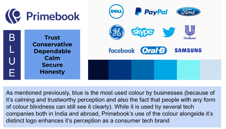
In contrast, blue conveys a sense of trust, stability, and professionalism, making it a popular choice for corporate branding with 38% of Fortune 500 companies utilizing the colour as per WizardPins (this can be related back to the fact that blue has the shortest wavelength, gets refracted the most and hence most visible color in the entire spectrum).
It’s also important to note that different colours carry cultural meanings that can vary across regions and contexts.
Evaluating a Startup’s Colour Strategy:
Based on the evidence so far, although colour schemes might seem simple, evaluating a startup’s overall colour and branding strategy as part of the due diligence process is important regardless of sector, segment or business model (B2C or B2B). Key questions to ask founders may include:
- What was the reasoning behind selecting specific colours for the brand?
- How do these colours align with the desired brand personality and values?
- Have cultural differences and varying colour associations been accounted for in global markets?
A thorough evaluation of a startup’s colour strategy can help identify potential branding risks, missed opportunities, or areas for improvement before investing.
Market Differentiation {and Integration}
In a competitive market, standing out is essential. Unique and strategic use of colour can help startups distinguish themselves from competitors. A memorable colour palette can enhance brand recall and preference, contributing to long-term brand loyalty. Let’s take a look at how Auxano’s portfolio companies have leveraged colour theory for effective branding.


Best Practices for Companies:
Maintaining consistency in colour usage across all brand touchpoints, including websites, packaging, marketing materials, and physical locations, is crucial for building strong brand recognition.
As companies scale or reposition themselves, evolving their colour palettes thoughtfully is important. Recommendations for companies include periodically auditing all brand assets to ensure colour consistency, carefully considering colour’s role during any rebranding efforts, and testing new colour palettes with consumer focus groups.
Takeaway:
Colour theory plays a pivotal role in developing effective branding and marketing strategies that resonate with target audiences.
One should also look at each company’s colour strategy, as colour choices can significantly impact brand perception and loyalty.
A deep understanding of colour theory principles enables more informed investment decisions and valuable guidance for portfolio companies looking to build impactful brands.
Author
Aditya Golani

